Vari Rebrand
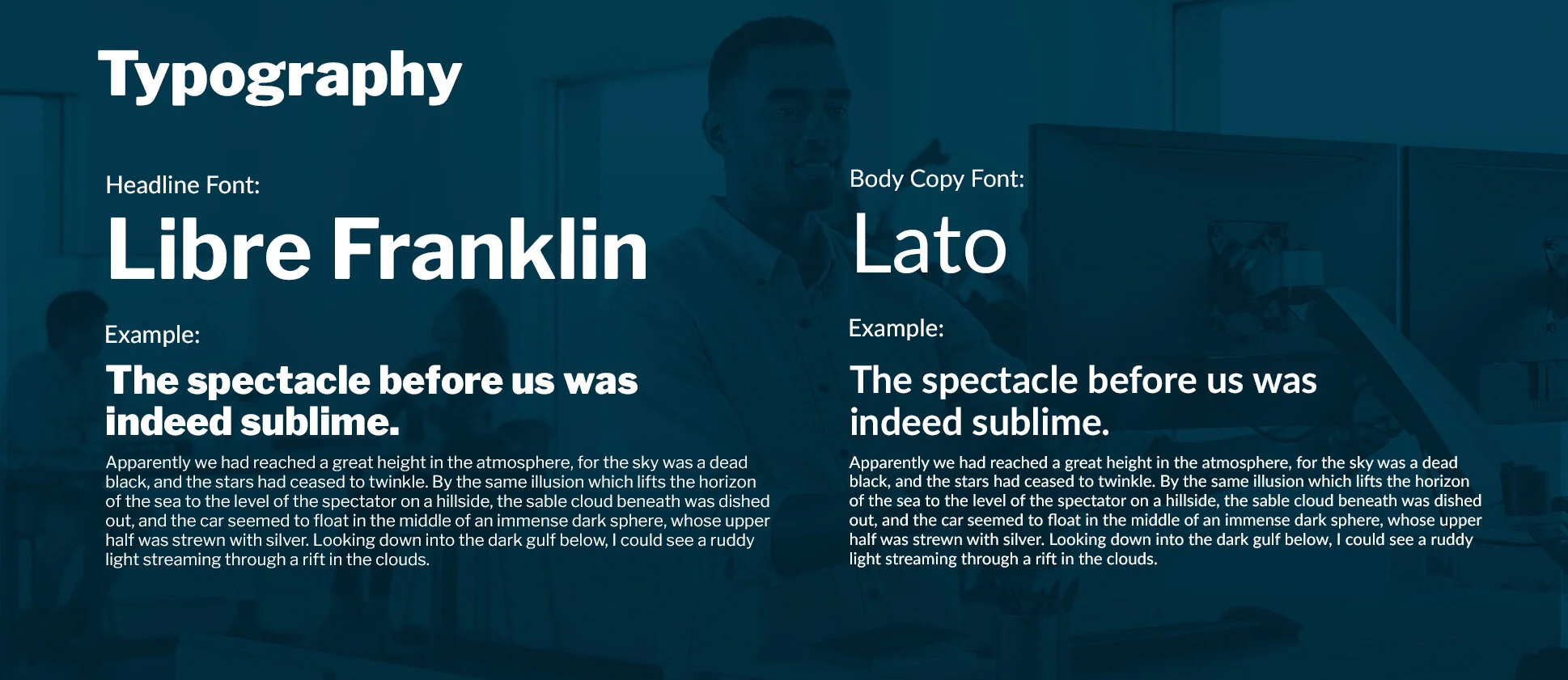
Working with the company Vari, formally known as VariDesk, we discovered limitations to the brand name when the company entered the full-office furniture world, so it was key in removing the desk portion of the identity. Essentially we wanted to simplify every aspect of the brand: the name, the delivery/installation process, and the customer experience. Knowing this we introduced brand new elements, included bold typography, bright colors, simple icons to the brand language to achieve the goal that Vari was a simple solution to a complex problem.
In media we wanted to emphasize the simplicity by highlighting messaging with bold typography matched with isolated product imagery paired with the bright colors. This is offset by white informational points to provide balance from the heavy imagery with a clean, and clear design. This was replicated throughout digital web assets, print advertisements, direct mailers and social media posts to let the world know about the shift in brand image.


